
The SINIOR | Coffee Shop brand identity is a refined and contemporary Wordmark that masterfully balances classic typography with modern, minimalist principles to communicate maturity, quality, and a premium coffee experience. The logo centers on the name “SINIOR,” which is rendered in an elegant, customized All-Caps Serif font that features high contrast between thick and thin strokes, immediately evoking a sophisticated, established, and luxury aesthetic often seen in high-end European branding. This stately wordmark is cleanly paired with the secondary descriptor “Coffee Shop” using a simple, modern Sans-Serif font, which grounds the brand in its contemporary retail function and creates a deliberate visual contrast with the formal main name. The entire design uses a stark, classic color palette (Black/Dark Gray on white or cream) to ensure high legibility and timeless appeal, positioning SINIOR as a dependable and exclusive destination for quality coffee.
The COZE brand identity is a masterclass in modern, maximalist streetwear branding, intentionally operating with multiple logotypes and typographic styles to maintain a versatile, fluid, and disruptive image. The brand successfully bridges high-end luxury aesthetics with casual street attitude. The core color palette is starkly minimalist—predominantly Black and White—allowing the complex typography and iconography to command attention. COZE avoids a single static identity, instead treating its name as a mutable graphic element. This dynamic approach positions COZE as a fashion label that doesn’t follow a single rule, reinforcing the motto seen in the files: “YOUR WARDROBE. YOUR RULES.”
The WITMAN’S BAR-B-Q brand identity is a masterful example of a Heritage Emblem, using a meticulously designed circular badge to communicate authenticity, longevity, and a dedication to traditional Texas-style techniques. The entire system is built upon a classic, appetite-inducing color palette: deep brown/black for the heavy typography and the central Steer Skull icon, set against a warm cream background, which suggests both robust flavor and established history, while a vibrant red is strategically used for key accents like the star on the skull’s forehead and the “TEXAS STYLE” designation to inject energy and regional pride. By combining a heavy, arching Slab-Serif wordmark with iconic Western imagery and grounding it with the “Est. 2003” date, the logo immediately positions WITMAN’S as a trusted, high-quality, and authentic barbecue institution whose message is concisely summarized by its motto: “ALL SMOKE NO JOKE.”
The PEACE COFFEE brand identity is a striking and memorable system designed to communicate its core values—peace, sustainability, and quality—through a bold, retro-inspired aesthetic. The entire design relies on high-impact simplicity and a strong commitment to its central message. The visual system uses a powerful, two-color palette: a warm, inviting Tomato Red (or Coral) dominates the background, serving as a vibrant, energetic base that suggests warmth and community. This is contrasted sharply with a thick, creamy Off-White/Cream for the typography, and a stark Black for the mascot’s silhouette. This palette is reminiscent of mid-20th-century advertising, giving the brand a feeling of instant nostalgia and reliability. The centerpiece is the unique Turtle Mascot, which cleverly integrates the iconic Peace Sign into its shell. This ingenious fusion makes the brand instantly recognizable, memorable, and visually reinforces its commitment to global or environmental peace.
The MEU BURGUER (My Burger) brand identity is an outstanding example of a visual pun and minimalist design, using a clever combination of typography and iconography to create an instantly recognizable and memorable mark. The entire logo is contained within a clean, single-line graphic that simultaneously reads as a hamburger and the brand’s name, achieving remarkable efficiency in communication. The primary aesthetic is sleek, modern, and high-contrast. The logo uses a dynamic, energetic Orange-Red or Burnt Orange against a stark black background, a choice that signifies appetite, quality, and a modern, premium fast-casual experience. The design’s success lies in its use of monoline geometry, where the wordmark is constructed solely from lines of uniform thickness, reinforcing the clean, precise, and contemporary nature of the brand. This entire system positions MEU BURGUER as a stylish, quality-focused burger concept that understands visual design.
The GRUB brand identity is a vibrant, energetic, and highly effective system built around a classic, expressive Mascot to communicate speed, service, and satisfying food. This identity utilizes a powerful, two-tone primary color palette: a rich, deep Cobalt Blue is used for the background and core accents, contrasted sharply with a bright, energetic Yellow for highlights and graphic energy. The entire mascot illustration is contained within a thick, clean White Outline that makes it pop off the blue background, giving it a playful, sticker-like quality perfect for merchandise and packaging. The central figure is a dynamic, retro-styled Mascot—a cheerful boy, possibly a delivery runner or satisfied customer, shown mid-stride with a huge, open-mouthed smile of excitement. Crucially, he is holding a large, stacked hamburger, which directly reinforces the “Grub” concept and specifies the product focus (likely burgers or fast-casual food). The style is distinctly reminiscent of mid-20th-century cartooning and advertising, giving the brand a feeling of instant nostalgia, reliability, and established history, which is subtly supported by the small “EST” and “2025” text flanking the main logo. This is a high-impact, character-driven identity designed for instant recognition and mass appeal.
The Fiera Films brand identity is a striking and complex visual system developed for a film production company that deliberately embraces a fierce, untamed aesthetic to communicate its creative intensity. The identity utilizes a distinctive color palette built on a dynamic contrast: a warm, intense burnt orange/tangerine provides the brand’s primary energy, which is grounded by a serious black/charcoal and balanced by a crisp cream or off-white background. This combination evokes a vintage, high-quality, and slightly nostalgic aesthetic, similar to classic sports apparel or old-school movie graphics. The overall look successfully positions Fiera Films as a high-impact creative house that brings intense passion to every project, moving beyond the typical corporate seriousness of the film industry.
The Davilla Pizza Delivery logo is a brilliant exercise in abstract representation, designed to convey speed, quality, and the chaotic fun of food delivery through a minimalist, modern aesthetic. The primary mark is a dynamic arrangement of brightly colored, abstract shapes that cleverly form the word “DaVILA.” These shapes use a palette of pizza-topping colors—rich tomato red, olive green, and vibrant cheese yellow/orange—implying the freshness and flavor of the ingredients without being overtly literal. The abstract nature of the logo gives the brand a sophistication rarely seen in the delivery sector, positioning it as a modern, design-forward service.
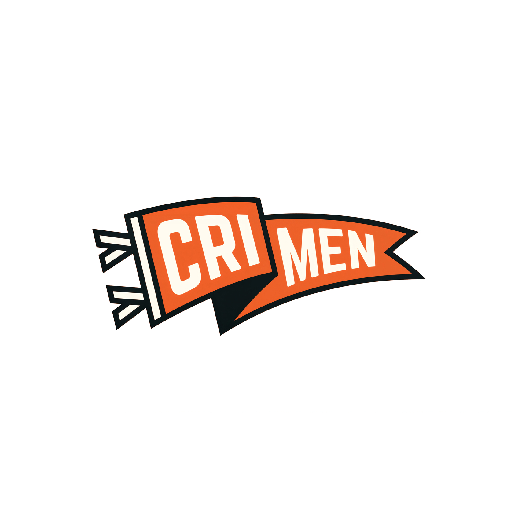
The Crimen Screen Printing identity is a raw, high-energy fusion of street art culture and professional service, deliberately positioning the brand as rebellious and expert in its craft. The visual system is anchored by a high-contrast palette of vibrant orange (#EC612A), a near-black charcoal, and a creamy off-white, echoing the industrial and edgy feel of printing and graffiti. The branding is highly modular, revolving around two main typography styles: an aggressive, custom script wordmark and a bold, blocky sans-serif that suggests speed and impact.
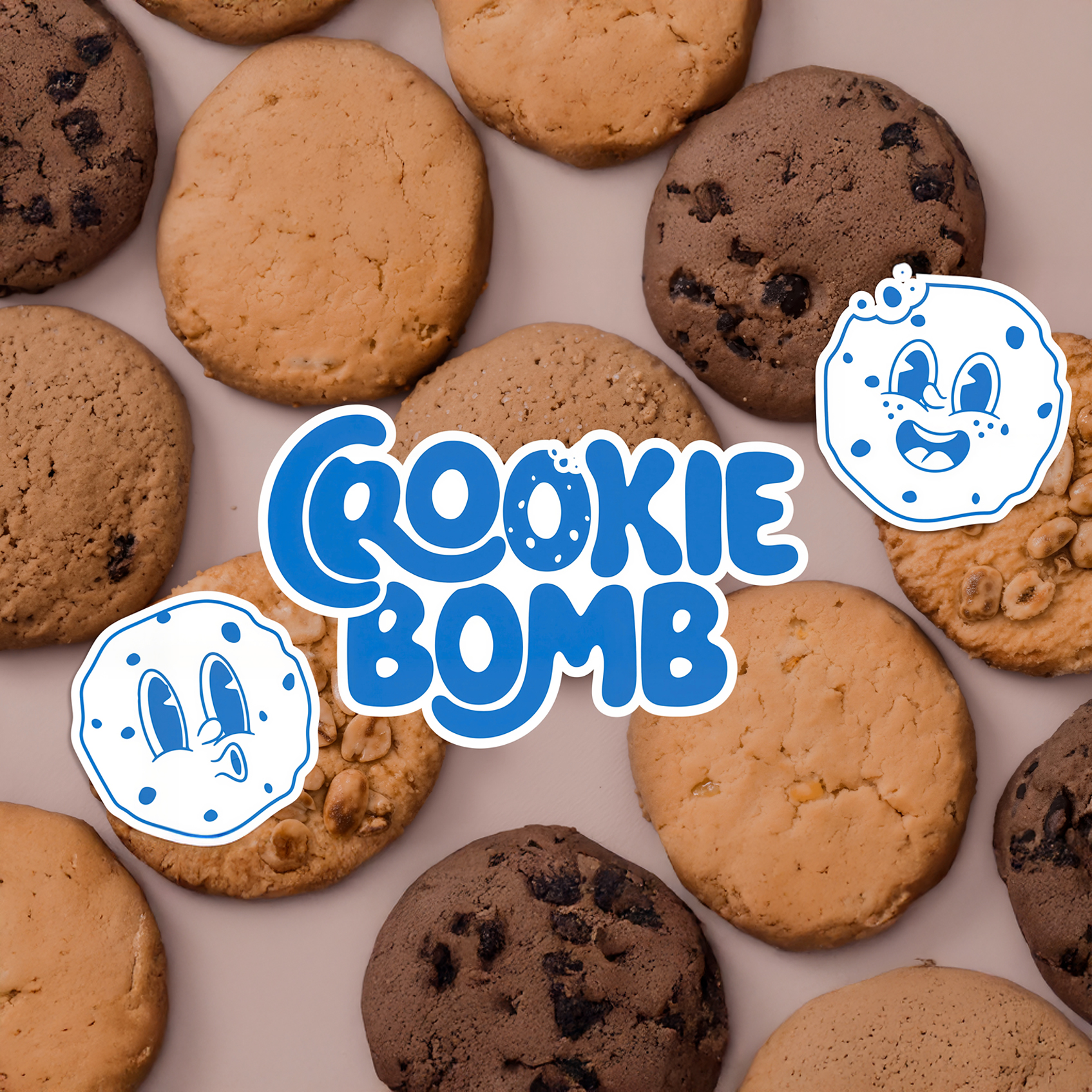
The Cookie Bomb brand identity is built on high-energy fun and approachability, designed to capture the attention of a playful, modern audience in the crowded dessert market. The core element is a charismatic mascot—a cookie that has come to life—rendered in a charming, vintage cartoon style using simple line work and a cheerful expression. This mascot often appears in an action pose, like running or floating, immediately signaling that this product is active, exciting, and full of flavor. The brand’s vibrant palette of electric blue, soft pink, and crisp white reinforces this joyful, almost juvenile energy, making the product feel irresistible and lighthearted.
The Bully Corp. identity is built upon a bold, playful, and instantly recognizable mascot that embodies a blend of youthful mischief and aggressive competence. The primary emblem features a grinning character, possibly a “bully,” rendered in a thick-lined, vintage cartoon style, complete with a baseball cap that features a subtle BC monogram. This design strategically leverages a nostalgic aesthetic—reminiscent of mid-20th-century sports mascots or classic Americana—to create a brand that feels established, spirited, and ready to compete. The core palette of distressed reddish-brown (terra cotta/red clay) and off-white reinforces this retro, durable sensibility.
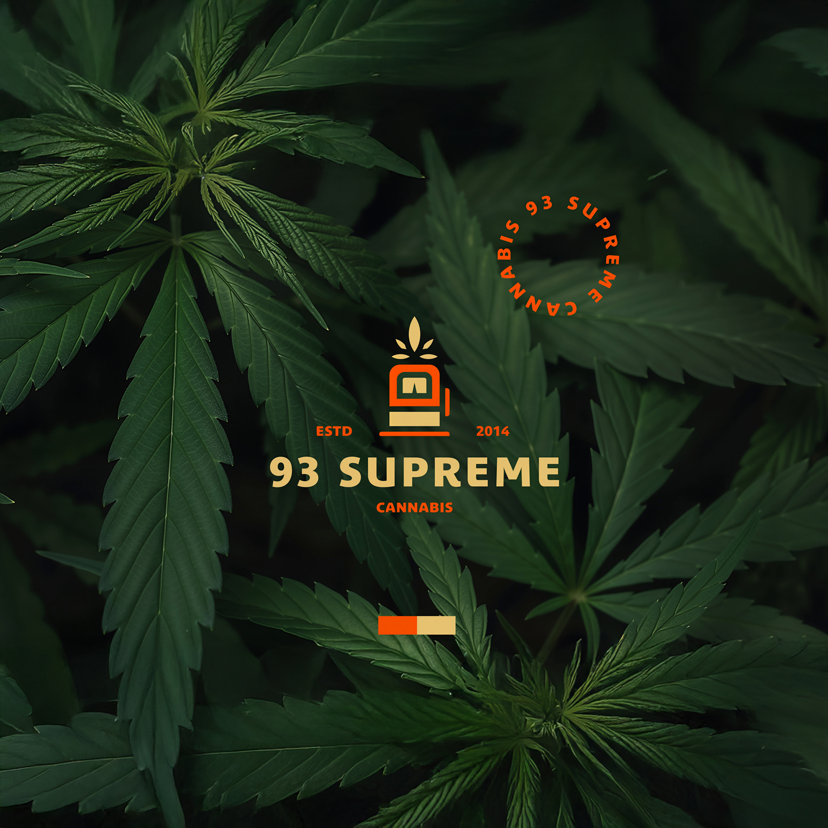
The 93 Supreme Cannabis logo is a strategic exercise in visual disruption, purposefully moving beyond the industry’s conventional aesthetic. The core mark is a distinctive fusion of two seemingly disparate concepts: the organic geometry of the cannabis leaf with the clean, structured lines of a gas pump or premium fuel dispenser. This unique iconography immediately communicates the brand’s core promise, establishing a powerful narrative that positions 93 Supreme as providing a reliable, high-octane product—the absolute best “fuel” for the body and mind. It is a modern symbol that anchors the brand in both nature and efficiency, signifying a product that is both natural in origin and supreme in delivery.


